
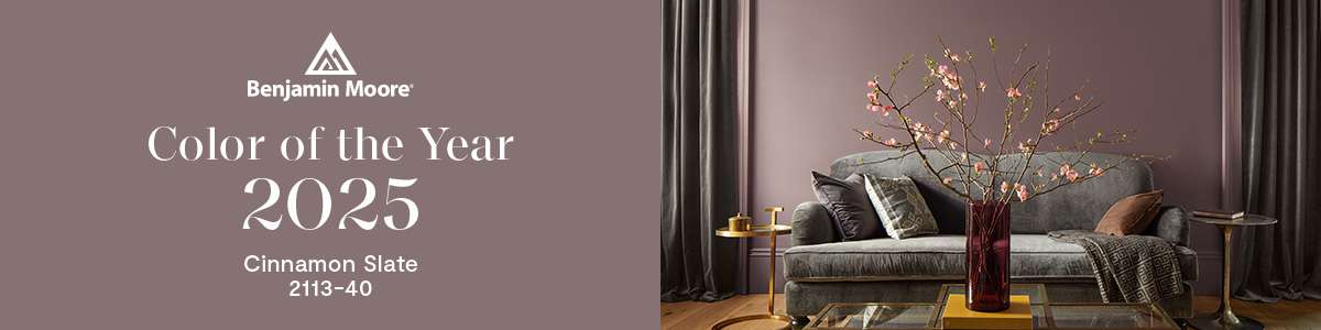
Explore Benjamin Moore Color Trends 2025
Each year, designers and homeowners alike anxiously wait for Benjamin Moore’s latest Color of the Year. This choice influences everything from home décor trends to furniture selections for the year ahead. Finally, the Color Trends of 2025 are here!
For 2025, Benjamin Moore has chosen Cinnamon Slate 2113-40. It’s subtle yet rich, and they describe it as “enduring style meets modern sensibility.” It’s warm, comforting, and bound to dominate the home design scene.
What does the Color of the Year and Color Trends 2025 Palette mean for your home? How can you make the most of these cozy colors in your next paint project? Here’s everything you need to know about the full lineup.
Cinnamon Slate: The 2025 Color of the Year
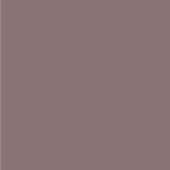
Let’s talk about the star of the 2025 color palette, Cinnamon Slate. This shade brings together heathered plum and velvety brown to create a color that feels both familiar and fresh. It’s perfect for spaces where you want to add warmth without overwhelming the room.
Cinnamon Slate creates an inviting and grounding atmosphere. We love it in areas where you want to feel at ease—like a living room or home office. It’s also incredibly versatile. You can pair it with lighter neutrals or go bold with darker accent colors.
The Color Trends 2025 Palette
Of course, Benjamin Moore never stops at just one color. They’ve curated a stunning lineup of shades that flow seamlessly from one room to the next. Each color has its own personality, but together they create a cohesive vibe throughout the home. Here’s a breakdown of the Color Trends 2025 Palette and where these colors can truly shine.
Sea Salt

Sea Salt (CSP-95) is a light, neutral shade that creates an airy, open feel in any space. Perfect for hallways, staircases, or entryways, this soft tone brings a clean and calming vibe to your home. You can pair deeper shades with Sea Salt to enhance the natural flow between rooms and create a solid foundation.
Leather Saddle Brown
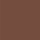
Leather Saddle Brown (2100-20) is a rich, earthy tone that adds warmth and depth to rooms. It’s great for creating a grounded atmosphere in rooms like a living room or study. You can use it to bring stability and comfort into cozy spaces. This hue pairs beautifully with lighter accents like Sea Salt for a balanced contrast.
Chowning’s Tan
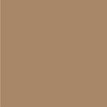
Chowning’s Tan (CW-195) is a versatile, adaptable tan shade that works well as a backdrop or a stand-alone neutral. Its soft warmth makes it ideal for living rooms, bedrooms, or any space where you want a subtle touch of coziness. Pair it with bolder pops of color for striking accents or let it shine on its own for a more understated yet refined look.
Tissue Pink

Tissue Pink (1163) is a warm, inviting hue that adds a playful touch to any space. It’s a great pink for spaces like entryways, where you want to greet guests with a welcoming feel. Use it to infuse a sense of fun and charm into smaller spaces or as an accent color in larger areas.
Stained Glass

Stained Glass (CSP-685) is a rich teal-like shade that makes a bold statement. Ideal for bathrooms or as an accent wall, this color adds depth and sophistication without swallowing the room. You can pair it with neutral tones like Glacier White for a striking, elegant balance.
Ashwood Moss

Ashwood Moss (1484) is a deep, earthy green that brings a natural, organic vibe to any room. Use this shade to create a cozy, grounded atmosphere in spaces like kitchens or dining rooms. Its darker tone adds depth and sophistication, so it’s also an excellent choice for accent walls and cabinetry.
Rosepine
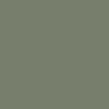
Rosepine (461) is the lighter, softer counterpart to Ashwood Moss. This gentle green brings light and airiness to your space, balancing out the deeper tones of its complement. Rosepine works beautifully in kitchens, dining rooms, or bedrooms where you want to create a serene atmosphere. Pair it with Ashwood Moss for a nature-inspired look that feels warm and refreshing.
Paris Rain
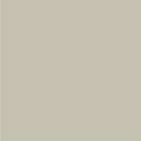
Paris Rain (1501) is a soft, moody hue that evokes a sense of quiet elegance. This color brings up feelings of calm and clarity, so it’s great for bedrooms and home offices. Really, it’s perfect for any space where you want to unwind or get creative.
Glacier White

Glacier White (OC-37) is the go-to choice for lovers of crisp, clean spaces. This timeless white is perfect for creating fresh bedrooms or bright, open living areas. Pair it with bolder shades like Stained Glass for a modern twist, or use it as a foundation for an all-white, minimalist look.
Color Trends for 2025: What to Expect
So, what can we expect to see in 2025 when it comes to home design? The 2025 palette is all about warmth, comfort, and timeless style. Earthy tones like Cinnamon Slate and Leather Saddle Brown are back and bigger than ever, adding coziness and depth to any room.
But don’t worry—light, neutral shades like Sea Salt and Glacier White are still trending for giving spaces that fresh, open feel. Nature-inspired greens like Ashwood Moss and Rosepine are also having a moment. These shades help us bring a bit of the outdoors inside. These shades are great for creating calming, natural spaces that feel relaxed and welcoming.
One fun trend to watch? Layering colors! The 2025 palette is designed to work together, so don’t be afraid to mix and match shades for depth and dimension. This year’s Benjamin Moore color trends make spaces feel inviting, lived-in, and effortlessly stylish.
Shop Benjamin Moore Color Trends of 2025 at Da Kine Paints
At Da Kine Paints, we’re thrilled to offer Benjamin Moore’s Color of the Year 2025 and the entire Color Trends 2025 Palette. Whether you’re livening up a room or planning a full home makeover, we have the perfect colors for your project.
As Maui’s premier Benjamin Moore retailer, Da Kine Paints is your go-to spot for all things paint. Stop by our store to check out our full selection of Benjamin Moore colors or chat with one of our paint experts. Let’s make your home feel just right—one beautiful color at a time!